Context
Redesigning a core surface like admin Home doesn’t happen often at Shopify. In early 2026, it did. Leadership kicked off a full rethink of Home: the layout, the hierarchy, and the role it plays for merchants at every stage of their journey.
A smaller group was pulled together to define what onboarding should feel like inside the new design, and I was one of three designers chosen for it. This is about one piece of that work.
Problem
Merchants don’t come to Shopify to complete an onboarding checklist. They come to start a business, launch a product, make their first sale. The tasks are just the means to get there.
The trouble is that onboarding systems typically measure progress by task completion, not by the broader outcome those tasks add up to. You finish a step and the system marks it done, but it never tells you what finishing it actually got you.
Shopify works this way too. Complete a task and the platform confirms it’s done, but it stays framed around the checklist, not around the merchant’s business. This can make onboarding feel abstract and directionless, like checking boxes for their own sake.
Task completion in the current onboarding bento.
Discovery
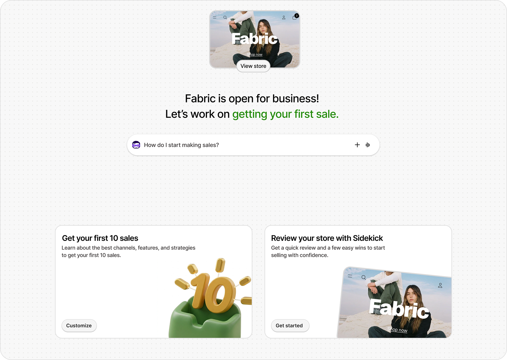
This was on my mind as we started designing the new Home. The redesign put Sidekick at the center of the page, making the chat input the primary way merchants would interact with Home. Onboarding tasks moved into cards beneath it, carrying over the same logic from the existing bento, but now arranged around Sidekick rather than standing on their own.
As designs progressed, we settled on a specific card behavior: once a merchant completed a task, its card would disappear. It kept the surface uncluttered and avoided a pile of finished cards sitting on Home with little purpose. But it also removed the one place a merchant could see what they’d done. If the cards vanish, where does progress live?
That question set the direction for the work. I wanted to find a way to give merchants a real sense of progress, one tied not just to tasks getting checked off, but to what those tasks were adding up to. Not just that they’d done something, but that they were getting somewhere.
Approach
I started thinking about how to make the meaning of onboarding tangible to a merchant in a way that actually helped them. I explored progress bars and a few other patterns, but they all felt abstract, a sense of motion without much substance behind it.
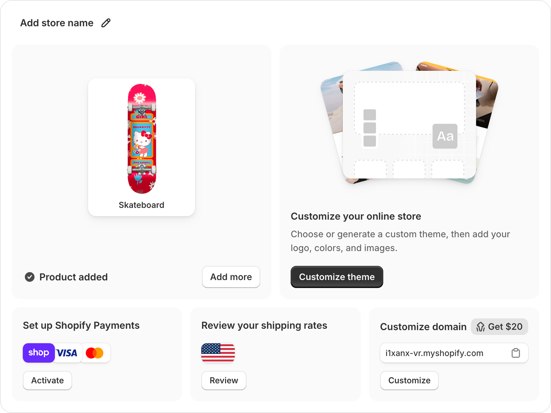
A better starting point was something the current bento already did. When a merchant completes a core task there, we surface what they made inside the completed card, the product they just added, the theme they chose. It gave a small sense of the store taking shape, and it felt more real than any progress bar.
Bringing that same idea to the new Home felt right: as a merchant worked through onboarding, the pieces of their store would stack up above the Sidekick input, their name, their theme, their products, the store coming to life in front of them. It gives a merchant an immediate read on their fundamentals. This is my store, this is what I’ve built.
Store components appearing as tasks are completed.
But seeing the pieces of your store come together only goes so far. It shows a merchant what they’ve made without telling them what it means, or what to do next. That’s when I started looking at the header above the Sidekick input, the line sitting front and center in the new design.
On Home today, that line is barely dynamic. It greets the merchant by name and does little else. That’s consistent with how most AI tools treat the space, less as a useful lever and more as an afterthought, a place for a friendly hello. I kept looking at it and thinking about how little it did, here and everywhere else, and how much prime real estate it was taking up to do so little.
Most AI tools use the header to greet or prompt the user.
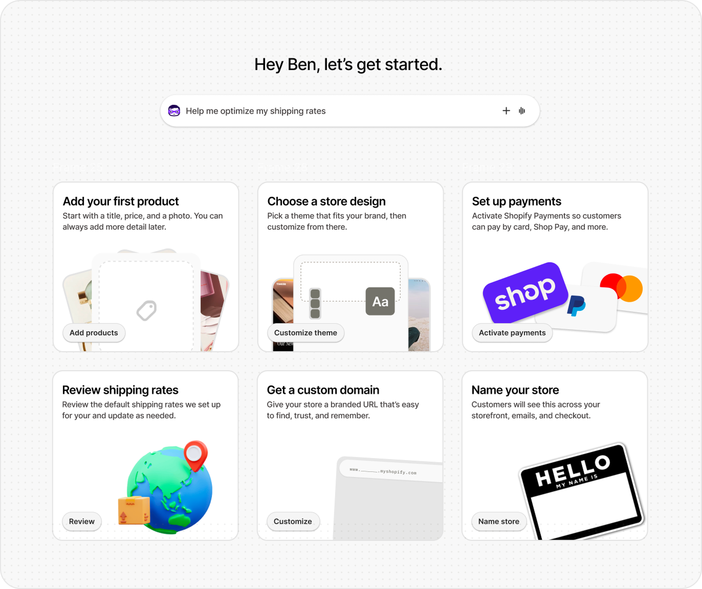
So I started to think about giving it a real job. What if that line actually did something useful for the merchant? What if, instead of a greeting, it reflected where they were in onboarding and what mattered next?
That question slowly turned into a pattern, and as I worked through it, I started designing what a header that actually contextualized a merchant’s progress could be. It would run on the same milestone events we already used to track tasks, and update as a merchant moved through them.
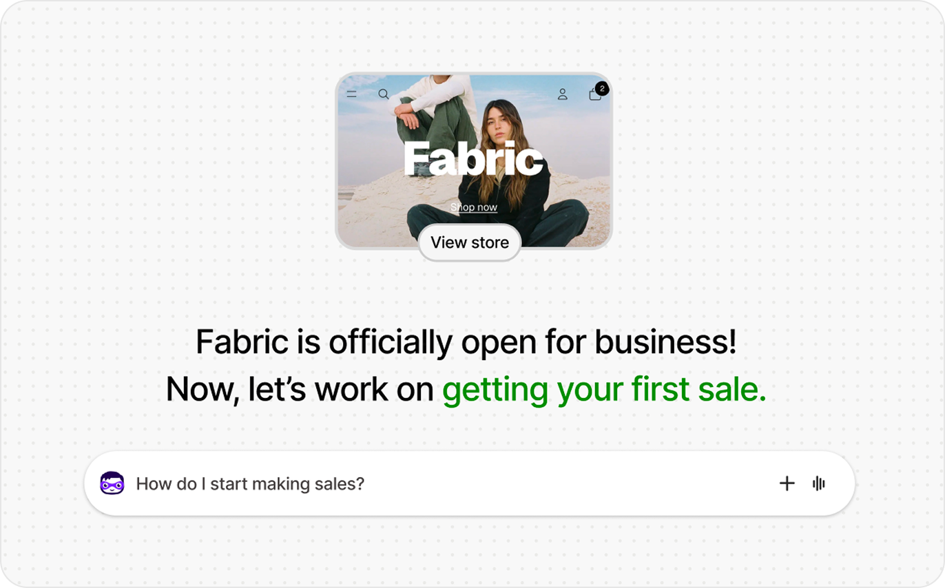
What I landed on was a two-line structure. The first line tells a merchant what they just did, but never in the language of the task. Reviewing shipping rates becomes ‘you’re all set to ship across Canada and the US.’ Setting up payments becomes ‘you’re ready to take orders and get paid.’ It turns a finished task into something the merchant can actually feel, rather than a box that’s been ticked.
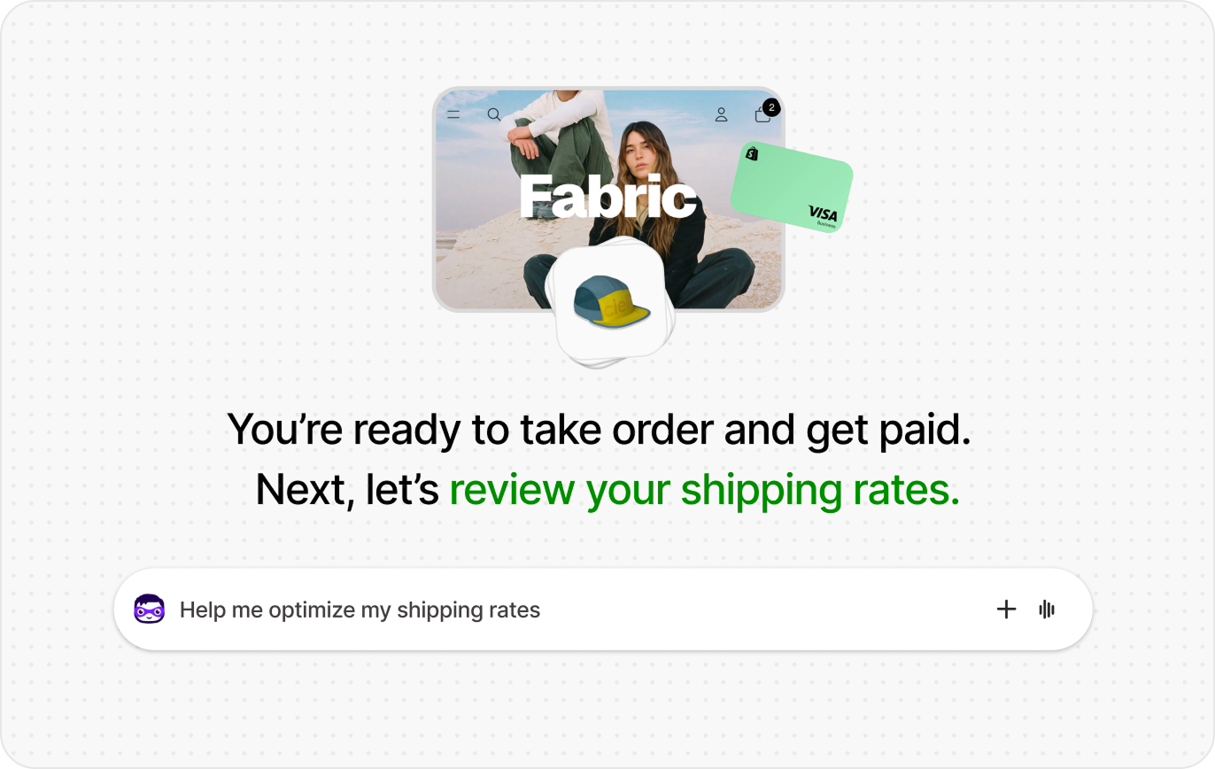
The second line points to what to do next. Shopify's onboarding tasks follow a specific order, so the line points a merchant to the next highest-leverage action in that sequence. Finish adding products and it points to store design. Finish store design and it points to payments.
The first line grounds the merchant in what they just accomplished.
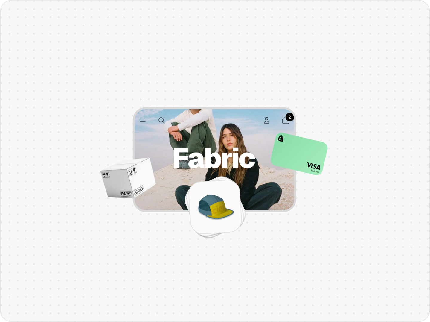
Longer-term, I see this getting more personalized, pushing merchants toward more specific actions based on what we know about them and what they’re trying to achieve. If someone is likely to sell abroad, for example, it could point them to international shipping rather than the default next step.
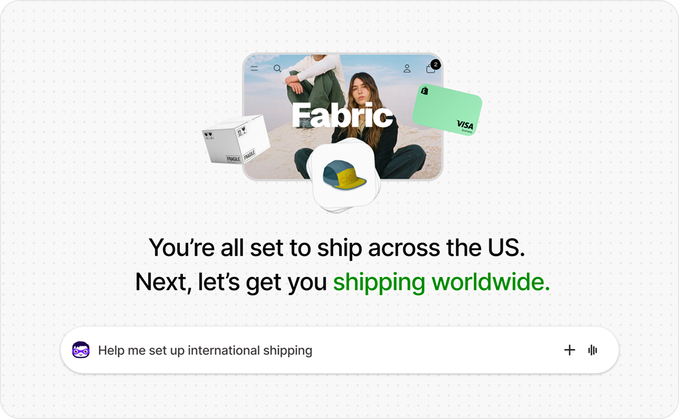
Example of more granular action suggestions.
It’s a small version of a larger idea I’d been pushing: that onboarding shouldn’t assume every merchant needs the same things in the same order. The header couldn’t fix that on its own, but pointing each merchant toward their own next-best step was a first step toward an onboarding that adapts to the person, instead of marching everyone down an identical list.
Vision
When the redesign ships, onboarding won’t feel like a checklist a merchant is grinding through. It will feel like a store coming together, with each step adding something they can see and understand. Finish a task and you don’t just watch it disappear, you find out you can take payments now, or ship to your customers, or that your store is ready to go live.
That’s the whole idea. Progress a merchant can actually feel, and a clear sense of what to do next to keep moving toward their first sale.